A logo for the Believer's International Worship center. It consists of an oval with BWIC contained within, with an arch connecting the B and C. Underneath it reads Believer's International Worship Center, stretching with the shape of the oval.

Logan Lehew Logo

BIWC Logos


These logos are for the Believer’s International Worship Center. These designs are meant to promote the unity of the church, without going too complex with its design. It is meant to be inviting, yet fiery in its passion. The logo is given in both the greyscale variant pictured above, and three full-color variants beow, allowing for the client to have a choice of which icon to go with, or stick with the basic monochrome logo for easier branding.
A Red variant of the BIWC Logo. The logo goes from a ligher red to a darker red as one moves from left to right.
A rainbow variant of the BIWC logo. Only BIWC and the arch are in a rainbow, and the colors flow smoothly from a red B to a blue C.
A more vibrant rainbow variant of the BIWC logo. The rainbow gradiant applies to each letter on its own, creating a vibrant, eyecatching display of color.
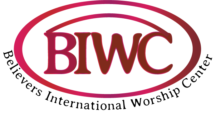
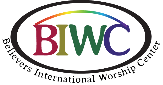
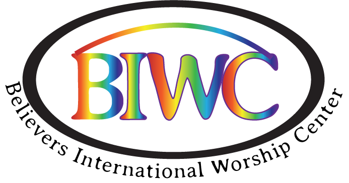
The red variant places the heaviest emphasis on the fiery passion that BIWC aims to invoke among its followers, while the rainbow variants instead place emphasis on the diversity of its community. For the rainbow, there is both a simpler version that only uses the main four colors, and a more extravigant version that uses a gradiant of colors to truly express BWIC’s unity.

Contact Information

225 Woodhurst Terrace, Wexford PA, 15090
loganlehew14@gmail.com ~2022 - Logan Lehew